
Rebrand or Refresh? A few things to think about as you consider how your brand looks to your customers.
Does your logo or overall brand feel dated? A touch inconsistent? Maybe slightly generic? Then your business might be due for a brand refresh. Don’t let the prospect intimidate you, because it’s not as scary as it sounds, and can mean the difference between a brand that you are proud of and one resonates with your audience, versus something that gets lost in the clutter and competition.
First, let’s define the difference between a brand refresh and a full rebrand.
A brand refresh is a strategic effort by a company to update certain elements of their existing brand without completely changing their identity. This can involve updating or evolving the brand’s visual elements (the logo, colors, typography), messaging, or overall brand strategy to better align with current market trends, consumer preferences, or the company’s evolving values and goals. A brand refresh is typically less drastic than a full rebranding effort but can still have a significant impact on how the brand is perceived by consumers.
A full rebrand is a complete reimagining of all of the previously mentioned elements, but will look and sound significantly different when complete.
Here are some examples of a full rebrand, and one specific example of a refresh that I’ll expand upon a bit later.


A quick note, as a visual guy, I’ll be focusing on the visual aspects of branding in this discussion. Now, let’s get into the signs that your brand might need some sprucing up.
Your logo isn’t flexible enough.
Flexibility in a logo is its ability to function in any space, format or application while still retaining a unified look and feel with the rest of your brand elements. For example, if your logo is too wide to work in vertical spaces, then you might consider adjusting your logo so that it has multiple versions to fit different spaces and still feel unified.
Other considerations would be if your logo has too many small or complex elements to be legible at smaller sizes, or maybe it uses too many colors to be economical to print in certain ways. Creating a more simplified and streamlined design and color scheme is the ticket.
Your brand elements feel inconsistent.
Brands consist of a diverse set of elements that get used across all marketing outlets, and if some of those feel disconnected, it leads to confusion and less effective marketing. Your logo, typefaces and fonts, color scheme, and photography style should all be chosen carefully and intentionally. Once those items have been chosen, they need to be used tactfully across all of your marketing efforts to build brand recognition and create that feeling of brand unity.
You and your competitors feel too alike.
There is a fine line between knowing exactly who you are and what you do while still remaining unique, versus being so literal with your branding that you cannot differentiate yourself amongst your competitors. If you find yourself in the latter category, it’s time to reassess your brand.
Your logo was trendy, 5 years ago.
Branding for certain businesses should feel contemporary, but it should always strive for timelessness. Relying too heavily on the latest design trends has the pitfall of those trends falling out of favor in the not-too-distant future. If your logo feels dated, then there’s a good chance that it fell prey to this problem. A quality brand designer will be able to preserve the elements of your branding that make you unique and have equity, while eliminating those that add to that feeling of outdatedness.


Last but not least, design fundamentals.
It should go without saying, but sometimes things get missed, and companies use logos with obvious (to us closest to the brand) design issues. Addressing potential typographic alignment and kerning, color palette clashes, and less than tidy illustrations are a great reason to explore a brand refresh. Check out some of the behind-the-scenes logo work we did to get a better idea of the detail we get into when refreshing a brand’s logo.

")

If any or all of these signs feel that they hit a bit too close to home, we would love to talk with you about ways we can work to bring new and lasting vibrance to your brand and help advance your business.
More Blogs
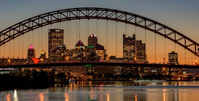
412 Day
To honor this year’s 412 Day, a day dedicated to honoring all things Pittsburgh, the Blink crew shared what defines the heart and soul of the vibrant metropolis most of us Blinkers call home. From...
A Blinker’s perspective on this year’s Super Bowl ads
-Mark Dello Stritto, Vice President of Creative My team asked me to share my thoughts about this year’s Super Bowl spots. I obliged, of course, but discussing Super Bowl ads has always been a little...

Mark Fallone – The English Sheep Dog – Servant Leader – Scallop Chef
Karlee Reynolds – Digital Marketing Strategist at Blink Mark and I sat down to discuss his new role as VP of Production at Blink. He gives us a look into how the industry and his...
