
Time For A Logo Makeover??
A logo is critical to a brand’s identity. Frequently lots of money has been invested in them through the years so that consumers immediately recognize them and they carry their own unique association with regards to the cache of that brand. How frequent and how dramatic the changes are depends on the desires of the company and the marketing team. Starbucks has had four logos in 50 years, Google has had eight logos in 25 years, Burger King has had six logos in almost 70 years, and Uber has had four logos in almost 20 years. So the frequency with which logos change is less important than the mere fact that your logo continues to evolve. Times change, fashions change, things get stale and fresh is good.
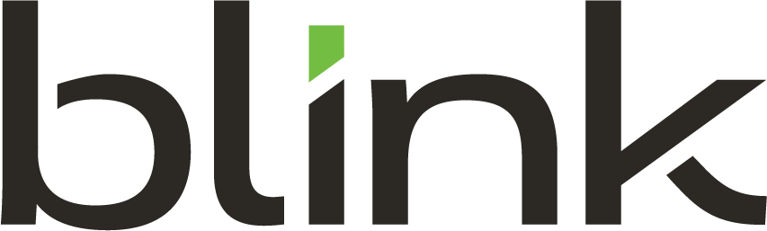
When 321Blink created our logo 10 years ago we wanted something that was fun. We were starting an agency that we believed was unique and refreshingly different from most traditional agencies and we wanted our logo to reflect that, so we gave it a bit of an animated/pop art feel to it. Some may not realize this but all of the letters that spell out BLINK were created using the numbers 3, 2, and 1.

Recently, 321Blink celebrated our 10th anniversary. Many of us have heard the statistics about business success rates, and they aren’t good. About 70 percent of businesses will fail by year ten. So we’ve not only survived against the odds, we have flourished. We felt it was the perfect time to reflect on what got us here and to revisit and overhaul our own logo as a sign of progress and to reflect our values and the values that made us what we are.
We like to attribute our strength, stamina and growth to our fundamental values when we started 321Blink that carry us through to this day: be Bold about challenging conventional thought, be Leaders in our company and our communities, exemplify Integrity in all of our dealings, be Nimble and adaptable for our clients, and above all, be Kind in everything we do. If there is one quality the world could use a little more of these days, it’s kindness.
With the letters BLINK representing the values that we hold near and dear, we also decided it was time to pivot to a shortened version of 321Blink to not only reflect those letters, but leaning into the shorthand version of what our friends and clients already call us. So now, we’re simply Blink. A new image, a new feel, and a renewed look on life as we press through what has been a difficult time for all of us. It’s sort of a 10 year birthday present to ourselves and we’re excited to share our new brand with the world.
![]()
Keep your brand fresh and make it reflect the excitement you have about your people, your clients, and your optimism for the future of your business. And call Blink if we can help you.
More Blogs
412 Day
To honor this year’s 412 Day, a day dedicated to honoring all things Pittsburgh, the Blink crew shared what defines the heart and soul of the vibrant metropolis most of us Blinkers call home. From...
A Blinker’s perspective on this year’s Super Bowl ads
-Mark Dello Stritto, Vice President of Creative My team asked me to share my thoughts about this year’s Super Bowl spots. I obliged, of course, but discussing Super Bowl ads has always been a little...
Mark Fallone – The English Sheep Dog – Servant Leader – Scallop Chef
Karlee Reynolds – Digital Marketing Strategist at Blink Mark and I sat down to discuss his new role as VP of Production at Blink. He gives us a look into how the industry and his...
